Le Mans Endurance Management unveils the new European Le Mans Series logo, giving the leading continental endurance race series a fresh look for the upcoming season and beyond.
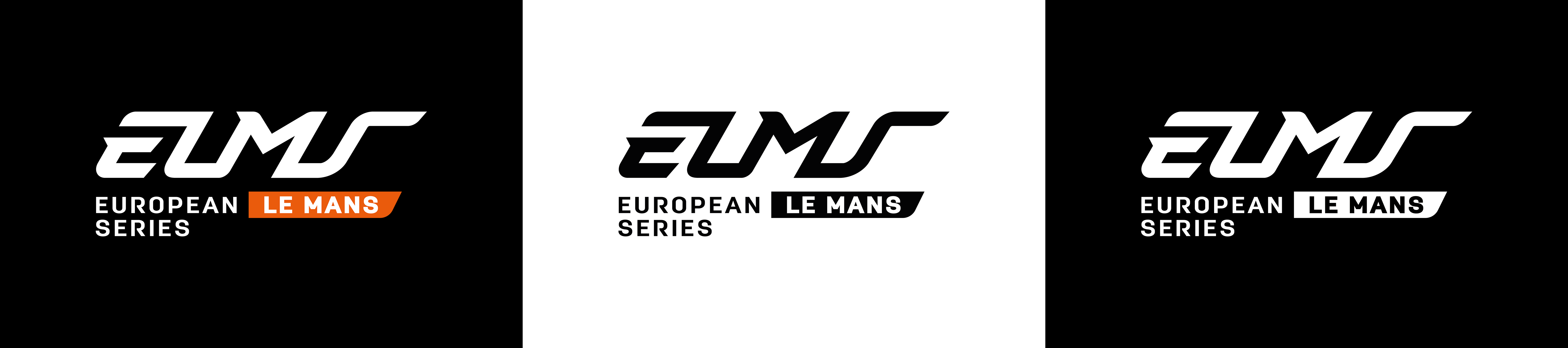
The new visual identity of the European Le Mans Series now features an elegant "navy blue" commonly referred to as "endurance blue".
The four letters, slightly inclined, maintain visual consistency with the three letters of the World Championship (WEC), injecting dynamism and evoking the sportsmanship that characterises our competitions. The typography of the "baseline" is identical to that used by the FIA World Endurance Championship.
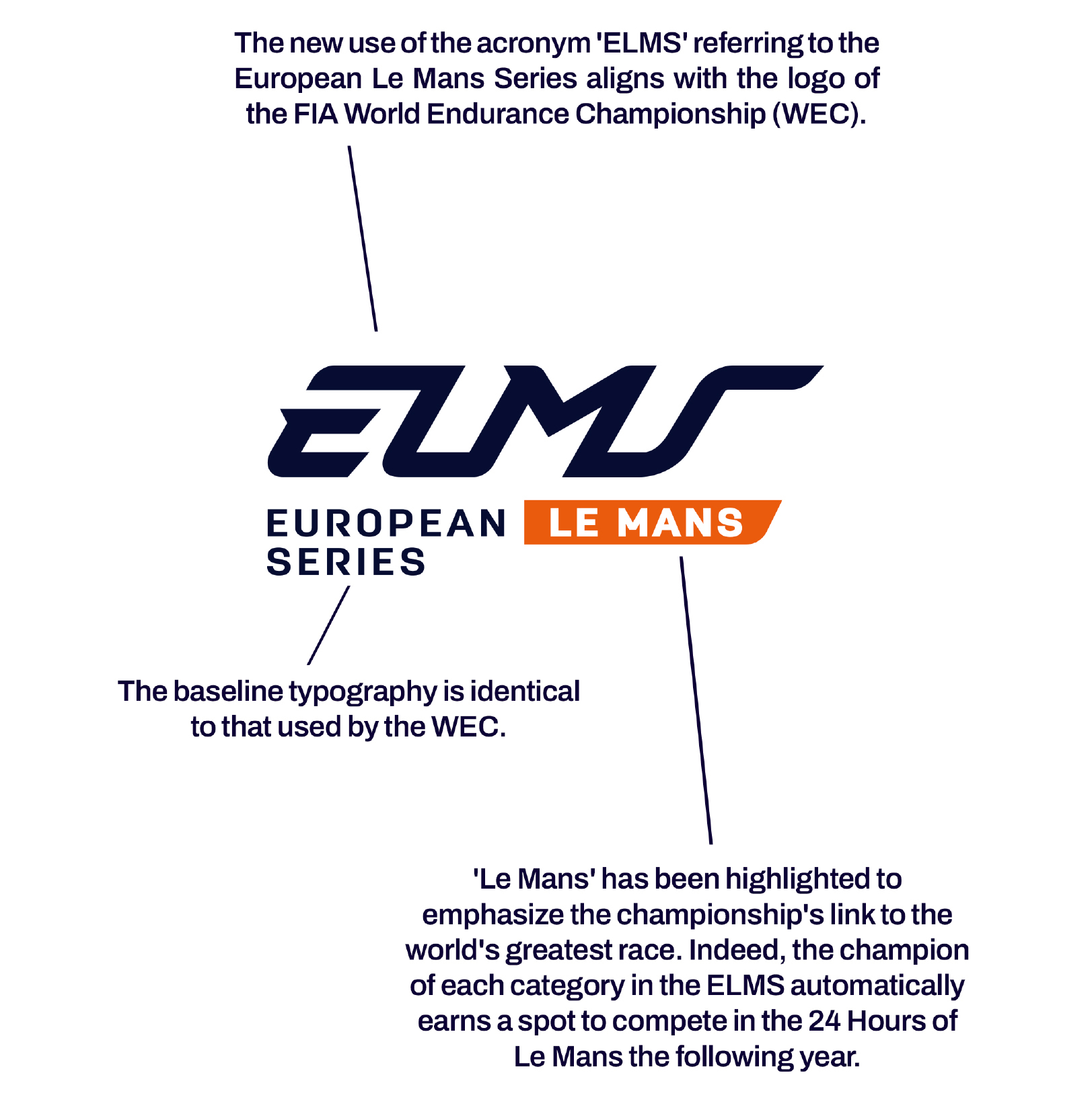
Furthermore, orange has been reimagined to rejuvenate the series' image. A bold frame, called a cartridge, has been added around the word "Le Mans" to highlight the championship's connection to the world's greatest car race. An instant reminder that the European Le Mans Series champion in each category automatically earns an invitation to participate in the 24 Hours of Le Mans the following year.
The four letters’ ELMS follow the vanishing lines of the cartridge surrounding "Le Mans" and are consistently used in conjunction with the "baseline," thereby reinforcing the championship's brand image.
Ultimately, the logo of the European Le Mans Series aspires to be both modern and dynamic, drawing inspiration from the prestigious FIA World Endurance Championship.
CLICK HERE to download the new ELMS logo.